A handy dropdown menu that can be used in for example the Toolbar component or other places. Very similar to the DropDown component.
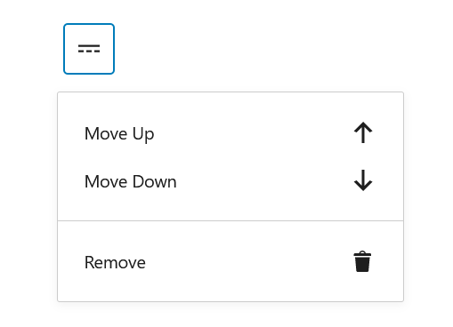
In the picture the components that are used inside the menu are MenuGroup and MenuItem, but you can also achieve a similar dropdown menu by just adding the prop controls (takes in an array) on the DropdownMenu component.
<DropdownMenu
	icon={ more }
	label="Select a direction"
	controls={ [
		{
			title: 'Up',
			icon: arrowUp,
			onClick: () => console.log( 'up' ),
		},
		{
			title: 'Right',
			icon: arrowRight,
			onClick: () => console.log( 'right' ),
		},
		{
			title: 'Down',
			icon: arrowDown,
			onClick: () => console.log( 'down' ),
		},
		{
			title: 'Left',
			icon: arrowLeft,
			onClick: () => console.log( 'left' ),
		},
	] }
/>
MenuGroup and -Item can also be used to design the DropdownMenu:
<DropdownMenu icon={ more } label="Select a direction">
	{ ( { onClose } ) => (
		<Fragment>
			<MenuGroup>
				<MenuItem icon={ arrowUp } onClick={ onClose }>
					Move Up
				</MenuItem>
				<MenuItem icon={ arrowDown } onClick={ onClose }>
					Move Down
				</MenuItem>

				{/* When a user can select between choices (radio btns basicly) */}
				<MenuItemsChoice choices={[
						{
							value: 'visual',
							label: 'Visual editor',
							shortcut: 's' //don't work out of the box as a shortcut - needs a shortcut component
						},
						{
							value: 'text',
							label: 'Code editor',
						},
					]}
					icon={ arrowDown }
					onSelect={ (e) =>console.log(e) }
					value="text">
				</MenuItemsChoice>
			</MenuGroup>
			<MenuGroup>
				<MenuItem icon={ trash } onClick={ onClose }>
					Remove
				</MenuItem>
			</MenuGroup>
		</Fragment>
	) }
</DropdownMenu>