Similar to a DropDownMenu, but with some more flexibility for how the toggle button and the content should be rendered.
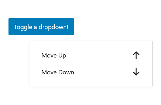
It might be more logic to use this if the dropdown menu is not in a Toolbar component. In the picture you see that the dropdown is triggered by a button, not an icon which is the trigger on a DropDownMenu component.
<Dropdown
	className="my-container-class-name"
	contentClassName="my-popover-content-classname"
	position="bottom right"
	renderToggle={ ( { isOpen, onToggle, onClose } ) => (
		<Button isPrimary onClick={ onToggle } aria-expanded={ isOpen }>
			Toggle a dropdown!
		</Button>
	) }
	renderContent={ ({ isOpen, onToggle, onClose }) => (
		<MenuGroup>
			<MenuItem icon={ arrowUp } onClick={ onClose }>
				Move Up
			</MenuItem>
			<MenuItem icon={ arrowDown } onClick={ onClose }>
				Move Down
			</MenuItem>
		</MenuGroup>
	) }
/>