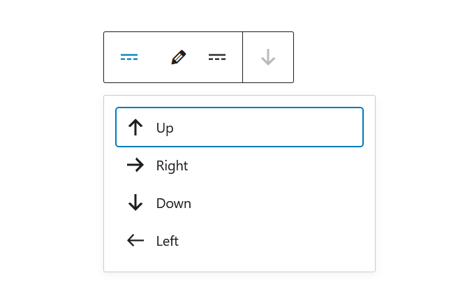
A toolbar that can be used to control a block. Used a lot by the default blocks in WordPress.
<Toolbar label="Options">
	<ToolbarItem>
		{ ( toolbarItemHTMLProps ) => (
			<DropdownMenu
				icon={ more }
				label="Select a direction"
				controls={ [
					{
						title: 'Up',
						icon: arrowUp,
						onClick: () => console.log( 'up' ),
					},
					{
						title: 'Right',
						icon: arrowRight,
						onClick: () => console.log( 'right' ),
					},
					{
						title: 'Down',
						icon: arrowDown,
						onClick: () => console.log( 'down' ),
					},
					{
						title: 'Left',
						icon: arrowLeft,
						onClick: () => console.log( 'left' ),
					},
				] }
			/>
		) }
	</ToolbarItem>
	<ToolbarGroup>
		<ToolbarButton
			icon={ "edit" }
			label="Edit"
			onClick={ () => console.log( 'Editing' ) }
		/>
		<ToolbarButton
			icon={ more }
			label="More"
			onClick={ () => console.log( 'More!' ) }
		/>
	</ToolbarGroup>
		<ToolbarButton
			icon={ arrowDown }
			label="More"
			isDisabled
			onClick={ () => console.log( 'More!' ) }
		/>
</Toolbar>
Can have three types of components as children: ToolbarItem, ToolbarGroup and ToolbarButton.