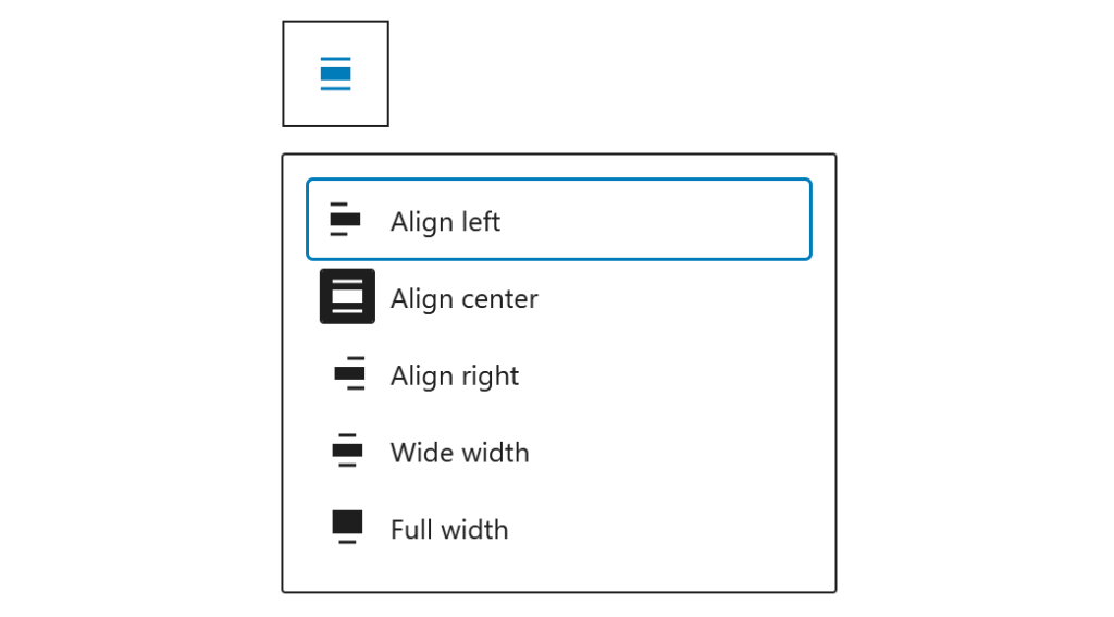
Can be used to set the position or size of something as centered, left, right, wide or full. Often used and seen as a child of BlockControls. Very similar to the AlignmentToolbar component.
import { registerBlockType } from '@wordpress/blocks';
import { __ } from '@wordpress/i18n';
import {
	useBlockProps,
	BlockAlignmentToolbar
} from '@wordpress/block-editor';

//styles that make it look good in the editor
import './editor.scss';

const BLOCKNAME = "block-alignment-control";
const BLOCKPATH = `wp-gb/${BLOCKNAME}`;

registerBlockType( BLOCKPATH, {
	apiVersion: 2,
	title: __( BLOCKNAME.replace("-", " ").toUpperCase(), 'wp-gb' ),
	description: __( 'The description' ),
	category: 'wp-gb',
	icon: 'smiley',
	attributes: {
		align: {
			type: "string",
			default: "left"
		}
	},

	edit: ( {attributes, setAttributes} ) => {

		return (
			<div { ...useBlockProps( { className: attributes.align } ) }>
				<BlockAlignmentToolbar
					value={ attributes.align }
					onChange={ ( nextAlign ) => {
						setAttributes( { align: nextAlign } );
					} }
				/>
			</div>
		)
	},
} );