Can be used to suggest/autocomplete things when a user types a character. Similar to how one can select a block in Gutenberg by writing “/”.
I did not manage to make the component itself work. However, the same functionality can be achieved using the autocompleters property on a RichText component.
import { registerBlockType } from '@wordpress/blocks';
import { __ } from '@wordpress/i18n';
import { RichText, useBlockProps } from '@wordpress/block-editor';
//styles that make it look good in the editor
import './editor.scss';
const BLOCKNAME = "autocomplete";
const BLOCKPATH = `wp-gb/${BLOCKNAME}`;
registerBlockType( BLOCKPATH, {
apiVersion: 2,
title: __( BLOCKNAME.replace("-", " ").toUpperCase(), 'wp-gb' ),
description: __( 'The description' ),
category: 'wp-gb',
icon: 'smiley',
attributes: {
value: {
type: "string"
}
},
edit: ( {attributes, setAttributes} ) => {
const autoConfigs = [
{
name: "Autocomplete",
// The prefix that triggers this completer
triggerPrefix: "/",
// The option data
options: [
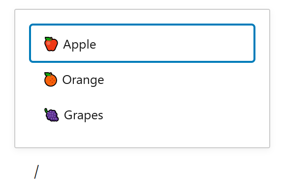
{ value: '🍎', label: 'Apple', id: 1 },
{ value: '🍊', label: 'Orange', id: 2 },
{ value: '🍇', label: 'Grapes', id: 3 },
],
// Returns a label for an option like "🍊 Orange"
getOptionLabel: option => (
<span>
<span className="icon" >{ option.value }</span> { option.label }
</span>
),
// Declares that options should be matched by their name or value
getOptionKeywords: option => [ option.label, option.value ],
// Declares that the Grapes option is disabled
getOptionCompletion: option => (
<abbr title={ option.label }>{ option.value }</abbr>
),
}
];
return (
<div { ...useBlockProps() }>
<RichText
autocompleters={ autoConfigs }
value={attributes.value}
onChange={ ( newValue ) => {
setAttributes( { value: newValue } );
} }
placeholder={ __(`Type ${autoConfigs[0].triggerPrefix} to choose a ${autoConfigs[0].name}`) }
/>
</div>
)
},
} );Custom autocomplete component
It might be easier to have this as its own component using the code below:
import { __ } from '@wordpress/i18n';

import { RichText } from '@wordpress/block-editor';

import { Fragment } from '@wordpress/element'

/**
 * An Autocomplete component
 * ----------
 * Based on a RichText component. Autocompletes when typing a prefix and gives a list with options that a user can select from.
 * Show text front end by using RichText.Content. If so, remember to include RichText from '@wordpress/block-editor'.
 *
 * @param   {String}  	value          The value of the RichText
 * @param   {Function}  onChange       The function that updates the value
 * @param   {Array}  	options        An array with options to be chosen between
 * @param   {String} 	name           The title of the component
 * @param   {String}  	triggerPrefix  The prefix to be used to show the options list
 *
 * @return  {Component}                 The component.
 */
const Autocomplete = ({value, onChange, options, name, triggerPrefix = "/", ...props}) => {
	// Function to handle the onChange event.

	const autoConfigs = [
		{
			name: name,
			// The prefix that triggers this completer
			triggerPrefix: triggerPrefix,
			// The option data
			options: options,
			// Returns a label for an option like "🍊 Orange"
			getOptionLabel: option => (
				<span>
					<span className="icon" >{ option.value }</span> { option.label }
				</span>
			),
			// Declares that options should be matched by their name or value
			getOptionKeywords: option => [ option.label, option.value ],
			// Declares that the Grapes option is disabled
			getOptionCompletion: option => (
				<abbr title={ option.label }>{ option.value }</abbr>
			),
		}
	];

	return (
		<Fragment>
			<RichText
				{ ...props }
				autocompleters={ autoConfigs }
				value={ value }
				onChange={ onChange }
				placeholder={ __(`Type ${autoConfigs[0].triggerPrefix} to choose a ${autoConfigs[0].name}`) }
			/>
		</Fragment>
	);
}

export default Autocomplete;
The custom component can be used like this:
import { registerBlockType } from '@wordpress/blocks';
import { __ } from '@wordpress/i18n';

import Autocomplete from '../components/Autocomplete/Autocomplete';

import { RichText, useBlockProps } from '@wordpress/block-editor';

//styles that make it look good in the editor
import './editor.scss';

const BLOCKNAME = "autocomplete-component-based";
const BLOCKPATH = `wp-gb/${BLOCKNAME}`;

registerBlockType( BLOCKPATH, {
	apiVersion: 2,
	title: __( BLOCKNAME.replace("-", " ").toUpperCase(), 'wp-gb' ),
	description: __( 'The description' ),
	category: 'wp-gb',
	icon: 'smiley',
	attributes: {
		value: {
			type: "string"
		}
	},

	edit: ( {attributes, setAttributes} ) => {
		return (
			<div { ...useBlockProps() }>
				<Autocomplete
					name="Autocomplete"
					options={ [
						{ value: '🍎', label: 'Apple', id: 1 },
						{ value: '🍊', label: 'Orange', id: 2 },
						{ value: '🍇', label: 'Grapes', id: 3 },
					] }
					value={ attributes.value }
					onChange={ ( newValue ) => {
						setAttributes( { value: newValue } );
					} }
				/>
			</div>
		)
	},

	save: ( {attributes} ) => (
		<div { ...useBlockProps.save() }>
			<RichText.Content value={ attributes.value } />
		</div>
	)
} );