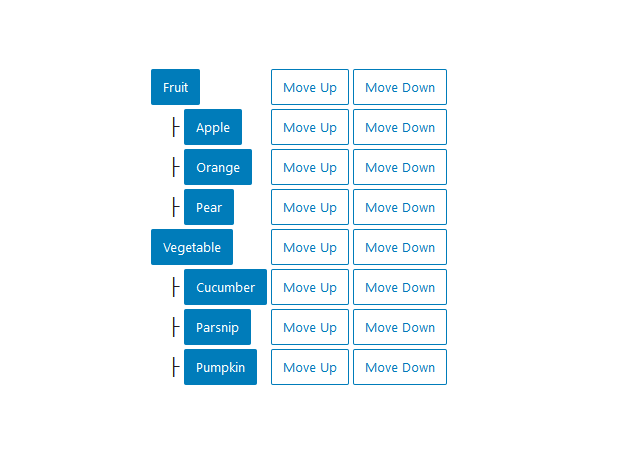
Creates a tree hierarchy. Users can navigate between the tree elements with the arrows. Could probably be good for breadcrumbs or stuff like that.
TreeGrid is often a pretty big chunk of code so the code below is exporting the component:
/**
 * WordPress dependencies
 */
import { Fragment } from '@wordpress/element';

/**
 * Internal dependencies
 */
import  {
	__experimentalTreeGrid as TreeGrid,
   __experimentalTreeGridRow as TreeGridRow,
   __experimentalTreeGridCell as TreeGridCell,
   __experimentalTreeGridItem as TreeGridItem,
   Button
} from '@wordpress/components';

export default { title: 'Components/TreeGrid', component: TreeGrid };

const groceries = [
	{
		name: 'Fruit',
		types: [
			{
				name: 'Apple',
			},
			{
				name: 'Orange',
			},
			{
				name: 'Pear',
			},
		],
	},
	{
		name: 'Vegetable',
		types: [
			{
				name: 'Cucumber',
				types: [
					{
						name: 'Cucruper',
					},
					{
						name: 'Cucrumba',
					},
				]
			},
			{
				name: 'Parsnip',
			},
			{
				name: 'Pumpkin',
			},
		],
	},
];

const Descender = ( { level } ) => {
	if ( level === 1 ) {
		return '';
	}
	const indentation = '\u00A0'.repeat( ( level - 1 ) * 4 );

	return <span aria-hidden="true">{ indentation + '├ ' }</span>;
};

const Rows = ( { items, level = 1 } ) => {
	return items.map( ( item, index ) => {
		const hasChildren = !! item.types && !! item.types.length;
		return (
			<Fragment key={ item.name }>
				<TreeGridRow
					positionInSet={ index + 1 }
					setSize={ items.length }
					level={ level }
				>
					<TreeGridCell>
						{ ( props ) => (
							<>
								<Descender level={ level } />
								<Button isPrimary { ...props }>
									{ item.name }
								</Button>
							</>
						) }
					</TreeGridCell>
					<TreeGridCell>
						{ ( props ) => (
							<Button isSecondary { ...props }>
								Move Up
							</Button>
						) }
					</TreeGridCell>
					<TreeGridCell>
						{ ( props ) => (
							<Button isSecondary { ...props }>
								Move Down
							</Button>
						) }
					</TreeGridCell>
				</TreeGridRow>
				{ hasChildren && (
					<Rows items={ item.types } level={ level + 1 } />
				) }
			</Fragment>
		);
	} );
};

export const _default = () => {
	return (
		<TreeGrid>
			<Rows items={ groceries } />
		</TreeGrid>
	);
};
Using the component in the WP block:
import {_default as MyTreeGrid} from "./MyTreeGrid";

/**
 * ...
 */

<MyTreeGrid />
Has three possible child components: TreeGridRow, TreeGridCell and TreeGridItem (did not manage to make this TreeGridItem work).
Is an experimental component. Use “__experimentalTreeGrid” to import it. Use __experimentalXXX for the child components.