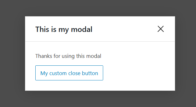
A simple modal that can have whatever content you want.
<Modal
	focusOnMount //focus on the first element in the modal
	shouldCloseOnEsc
	shouldCloseOnClickOutside
	overlayClassName="my-extra-modal-overlay-class"
	title="This is my modal"
	onRequestClose={ e => console.log("Closing modal") }
>
	<p>Thanks for using this modal</p>
	<Button isSecondary onClick={ e => console.log("Closing modal") }>
		My custom close button
	</Button>
</Modal>
Have some handy props as: shouldCloseOnEsc, shouldCloseOnClickOutside, overlayClassName (used to add custom styles to the overlay), onRequestClose.