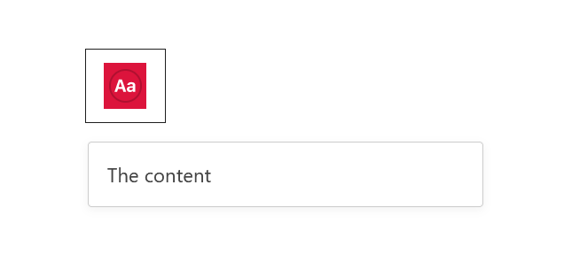
A toolbar box where colors of the toolbar icon can be styled. In most cases it would have its natural place in the BlockControls component.
import { registerBlockType } from '@wordpress/blocks';
import { __ } from '@wordpress/i18n';
import {
	useBlockProps,
	BlockColorsStyleSelector,
} from '@wordpress/block-editor';

//styles that make it look good in the editor
import './editor.scss';

const BLOCKNAME = "block-colors-style-selector";
const BLOCKPATH = `wp-gb/${BLOCKNAME}`;

registerBlockType( BLOCKPATH, {
	apiVersion: 2,
	title: __( BLOCKNAME.replace("-", " ").toUpperCase(), 'wp-gb' ),
	description: __( 'The description' ),
	category: 'wp-gb',
	icon: 'smiley',

	edit: ( {attributes} ) => {

		return (
			<div { ...useBlockProps() }>
				<BlockColorsStyleSelector
					BackgroundColor={({children}) => <div style={{backgroundColor: "crimson"}}>{children}</div> }
					TextColor={({children}) => <div style={{color: "#fff"}}>{children}</div> }
				>
					<div>The content</div>
				</BlockColorsStyleSelector>
			</div>
		)
	},
} );