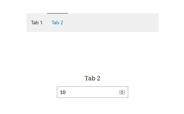
A panel with tabs.
The component has a function as a child which has a default parameter that represents a single tab. Then the user can use that parameter to render the default HTML for each tab.
<TabPanel
	className="my-tab-panel"
	activeClass="active-tab"
	orientation="horizontal"
	initialTabName="tab2"
	onSelect={ (tabName) => console.log( 'Selecting tab', tabName ) }
	tabs={ [
		{
			name: 'tab1',
			title: 'Tab 1',
			className: 'tab-one',
		},
		{
			name: 'tab2',
			title: 'Tab 2',
			className: 'tab-two',
		},
	] }>
	{
		( tab ) => (
			<PanelBody>
				<p>{ tab.title }</p>
				<NumberControl
					onChange={ e => console.log(e) }
					isDragEnabled
					isShiftStepEnabled
					shiftStep={ 10 }
					step={10}
					value={ 10 }
				/>
			</PanelBody>
		)
	}
</TabPanel>
Has handy props as “activeClass” (class of the active tab), “initialTabName” (which tab is selected by default), “onSelect” and “tabs” (an array with info about the tabs: name, title, className).