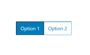
Works like a group of radio inputs but looks like a group of buttons. Uses the Radio component as a child which just need a value (not the “checked” prop).
Very similar to the RadioControl component but with buttons instead of regular radio inputs.
<RadioGroup
	id="default-radiogroup"
	onChange={ e => console.log(e) }
	defaultChecked="option1"
	label="options" //aria-label - not label really
>
	<Radio value="option1">Option 1</Radio>
	<Radio value="option2">Option 2</Radio>
</RadioGroup>
Is an experimental component. Use “__experimentalRadioGroup” to import it. Use __experimentalRadio for the child component.