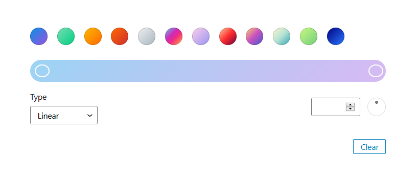
Used to select a gradient. Very similar to the GradientPicker from the components package, the difference is that the default WordPress gradients will be chosen if no gradients are provided. Best practice might be to use this one.
import { registerBlockType } from '@wordpress/blocks';
import { __ } from '@wordpress/i18n';
import {
	useBlockProps,
	__experimentalGradientPicker as GradientPicker
} from '@wordpress/block-editor';

//styles that make it look good in the editor
import './editor.scss';

const BLOCKNAME = "gradient-picker";
const BLOCKPATH = `wp-gb/${BLOCKNAME}`;

registerBlockType( BLOCKPATH, {
	apiVersion: 2,
	title: __( BLOCKNAME.replace("-", " ").toUpperCase(), 'wp-gb' ),
	description: __( 'The description' ),
	category: 'wp-gb',
	icon: 'smiley',
	attributes: {
		colorValue: {
			type: "string",
			default: "linear-gradient(135deg,rgba(6,147,227,1) 0%,rgb(155,81,224) 100%)"
		}
	},

	edit: ( {attributes, setAttributes} ) => {
		return (
			<div { ...useBlockProps() }>
				<GradientPicker
					value={ attributes.colorValue }
					onChange={ (newValue) => setAttributes({colorValue: newValue}) }
				/>
			</div>
		)
	},
} );
Check out the GradientPicker from the components package to see how the gradients array is set up.
Has a variant where it is wrapped in a panel: GradientPickerPanel
Has a variant where the component can have a heading/label: GradientPickerControl
Has a more advanced version colors also can be chosen: ColorGradientControl